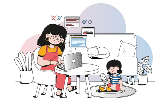
PROJECT
Two’s Redesign
Making an app more accessibility friendly.
My role: UX Designer
Platform: Mobile App
Tools Used: Figma
context
Two’s is a note taking & organization app.
It allows you to plan your schedule by writing notes for each day.
TASK
I examined and redesigned the app to be more accessibility friendly.
problem
How might we redesign this app to make it more friendly to those with language barriers, visual disabilities, and cognitive disabilities?
Process
Step #1
Research
Step #2
Analyze
Step #3
Design
Step #4
Refine
Part #1 Research
I conducted three rounds of user interviews
I gave users four tasks and observed the participants’ use of the app, noting the challenges they faced along the way.
I noted my observations by recording participant reactions of each screen in the user flows.
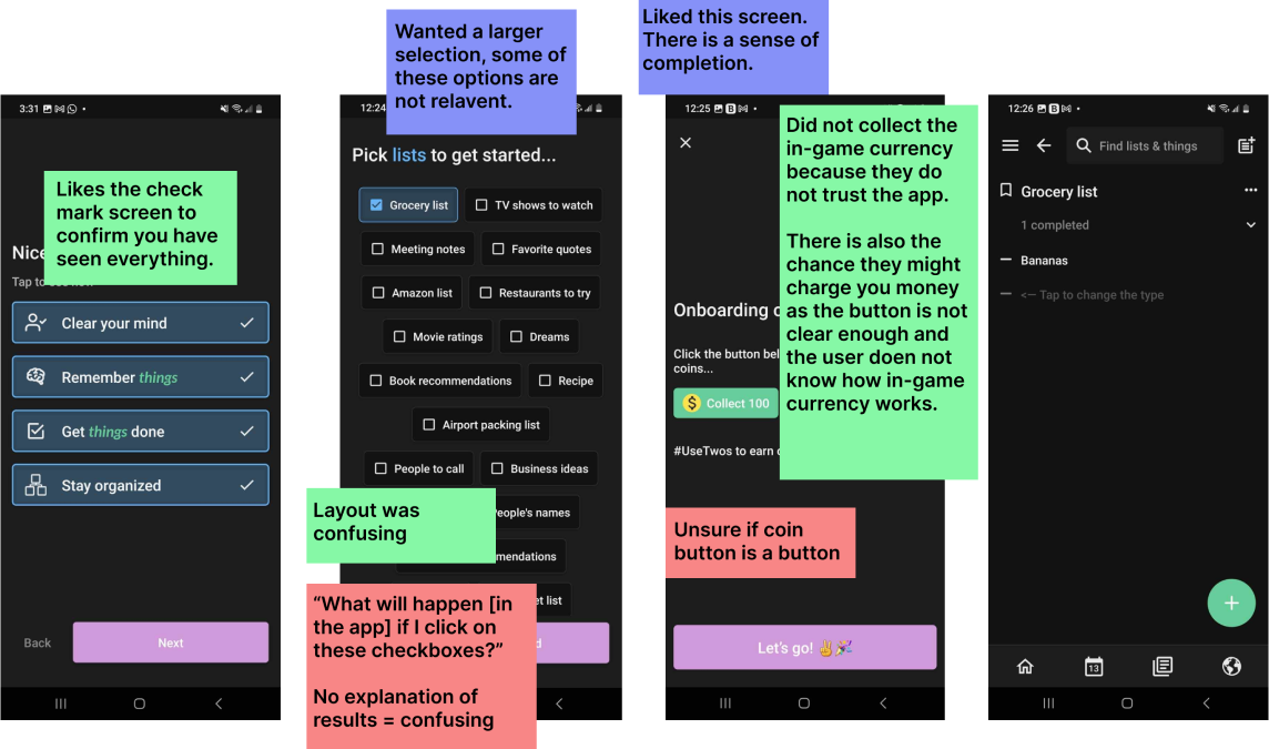
*This is a small section of the full observation notes
I then compiled an interview transcripts into an affinity map.
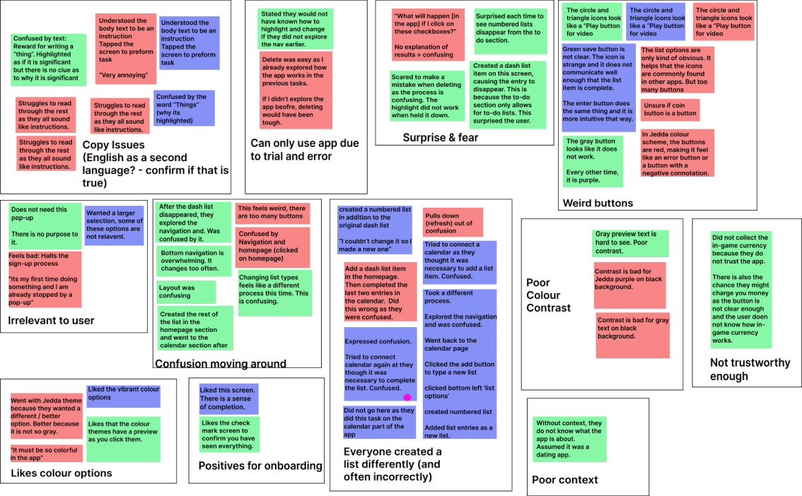
I then formed insights from these themes.
Confusing instructions
Instructions are misleading due to inaccurate writing and design.
No hints given
The app does not give the user any heads up about future consequences to present actions.
Poor colour design
There are user interface challenges. This is because having multiple colour theme options changes the contrast and the meaning of the design.
Vague instructions
Instructions are too vague as they are not listed clearly enough.
Too many ways to do one task
Creating a list was difficult because there are too many ways to create a list.
Poorly designed text editor
Editing a list was difficult because the navigation and list menu are too cluttered and inconsistent.
I then formed user needs from these insights.
Clear Colour Scheme
Colour schemes cannot not conflict with commonly understood meanings for certain colours. For example, red cannot indicate a positive action and green cannot indicate a negative action.
Intuitive Navigation
There should only be one menu to navigate the app instead to two. There should also only be one way to conduct each task. Different list types should not be separated as different menu items.
Simple Copywriting
Copywriting should be brief and written in simple grammatically correct language.
Part #2: Analysis
Based on the research findings, I created two user personas.
Persona #1: Abraham, The International Student
A new international student attending university.
He has a poor diet and sleep schedule.
English is also his second language.
His Goals
To keep proper organizational habits to succeed academically.
His Pain Points
Since English is his second language, he can find it difficult to understand more complex nuances of the English language.
User Statement
As someone whose first language is uncommon, and therefore not listed on the language options menu, I want non-verbal ways to understand the app so that I can still preform tasks without any confusion.
Persona #2: Sadie, older working professional
An older working professional working as a senior software developer.
Work consumes her life and often interrupts time that could be spent with her kids and partner.
Her Goals
To maintain a healthy work/life balance
Her Pain Points:
Has poor eyesight due to looking at screens so often.
Cannot spend time with family due to being busy with work.
User Statements
As a busy working professional, I want to quickly convert a bullet list to a to-do list so that I can efficiently organize my work.
As someone with poor eyesight, I want to customize colour settings so that features to edit lists become more visible.
Part #3: Design
I based my design on the personas above
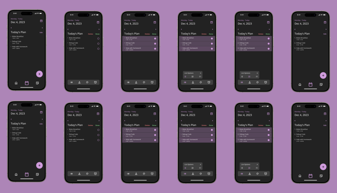
Task: Changing a bullet list to a numbered list
Users stated it was difficult to change list types as lists moved to different menu options based on the list type
Scenario: Sadie creates a list to organize her work and family life. She decided to change the bullet list with a numbered list.
Scenario: Sadie creates a list to organize her work and family life. She decided to change the bullet list with a numbered list.
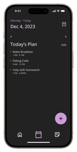
Med-fi Prototype
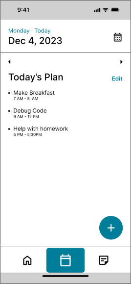
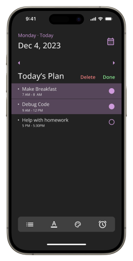
Tap “Edit”
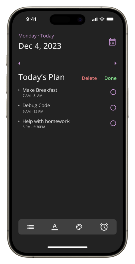
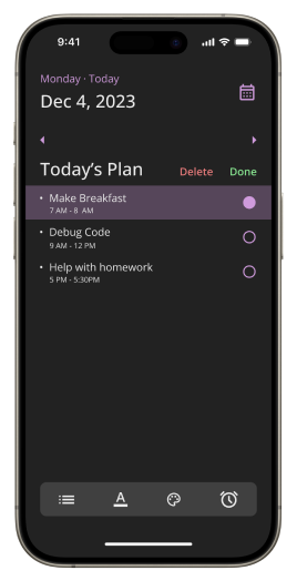
Highlight desired list options
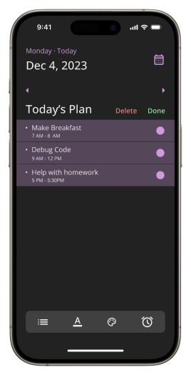
Highlight desired list options
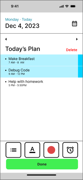
Highlight desired list options
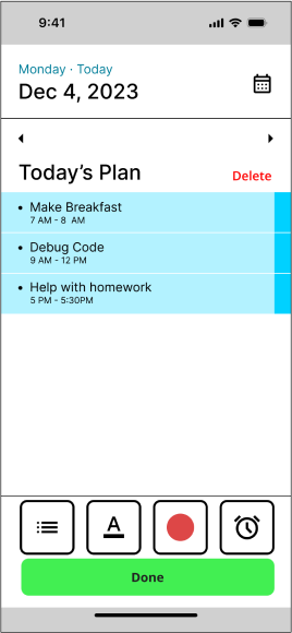
Highlight desired list options
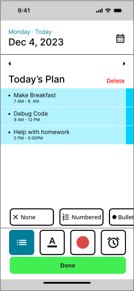
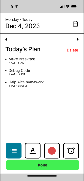
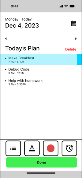
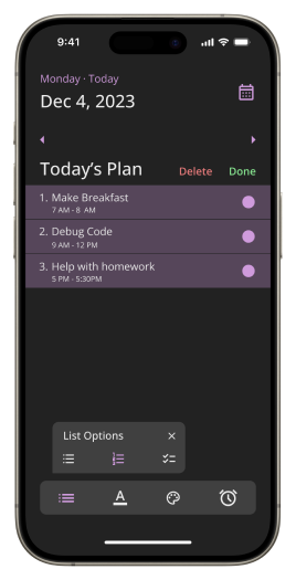
Tap list options
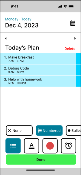
change to numbered list. Tap “Done”
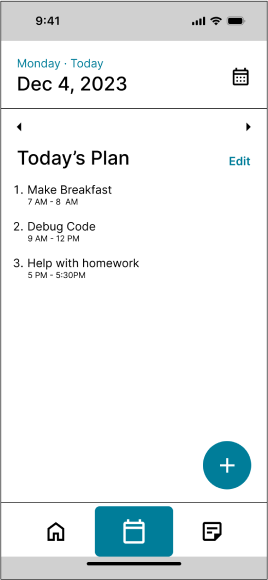
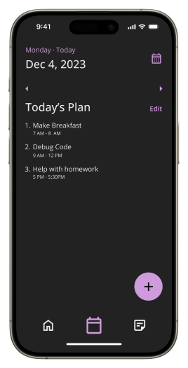
Changed from bullet to numbered list
Part #4: Refine
Based on feedback, I made edits to the next iteration
I placed the done button next to the delete button as that is the convention for Apple products
I refined the design of the edit menu by referencing other notes apps.
Hi-fi Prototype
Tap “Edit”
Highlight desired list options
Highlight desired list options
Highlight desired list options
Highlight desired list options

Tap list options
change to numbered list. Tap “Done”
Changed from bullet to numbered list