An app to manage the experience at a private park.
This was a team project
My role: Researcher & UX Designer
Platform: Mobile App
Tools Used: Figma
context
The client: A developer for a new private park called, ThePark.
the task
We created a product to manage and enhance the experience of park members.
problem
How might we integrate a digitial product into a physical park space?
Our personas sought a solution that enhances their ability to plan and manage their activities, discover new trails, receive real-time alerts about potential hazards or updates, and connect with fellow outdoor enthusiasts.
Process
Step #1
Research
Step #2
Analysis
Step #3
Design
[Iteration & Testing]
Part #1 Research
We ran research interviews with five participants.
All participants were members of a private park.
All participants lived near ThePark.
All participants had outdoor interests.
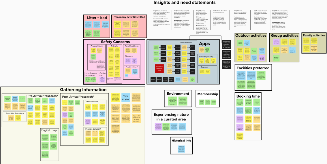
We then compiled an interview transcripts into an affinity map.
Part #2: Analysis
We used this affinity map to create key insights.
People don’t like static maps
The static nature of physical maps presents a challenge for individuals in accurately following directions.
People want lots of detail about trails
Individuals seek current information about their environment, including weather conditions, available activities, and lesser-known details pertinent to first-time visitors, such as the bug or wildlife population.
Sending reports provide safety
Individuals are keen to have some way to report a hazard or injury that notifies authorities of any safety concerns or incidents within the park.
We then created user need statements.
Needs dynamic maps
As a user seeking navigation assistance, I require dynamic mapping that adapt to real-time changes, as static physical maps often hinder my ability to accurately follow directions, ensuring a smoother and more reliable navigation experience.
Real-time updates
As a user exploring new environments, I require access to real-time information on weather conditions, available activities, and lesser-known details such as wildlife populations, to make informed decisions and enhance my overall experience.
Report hazards & injuries
As a park visitor concerned about safety, I need a feature within the app to report hazards or injuries, ensuring instant notification to park authorities and fostering a safer environment for all visitors.
Part #3: Design
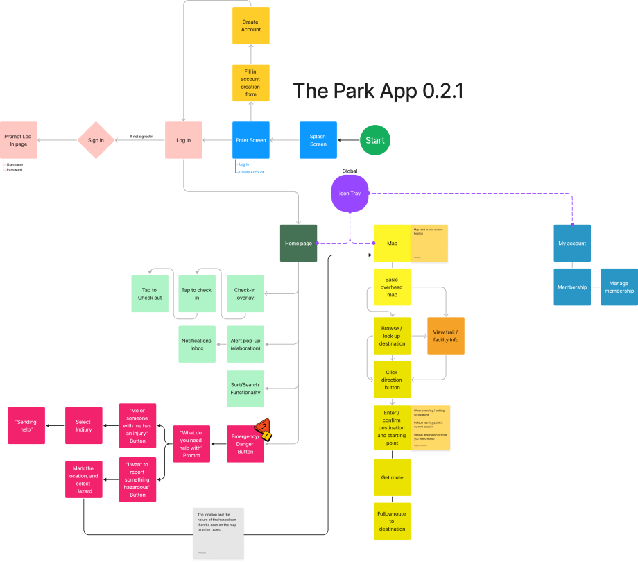
We created our final designs based on these need statements.
After multiple iterations, we established our user flow.
We then created our final prototype.
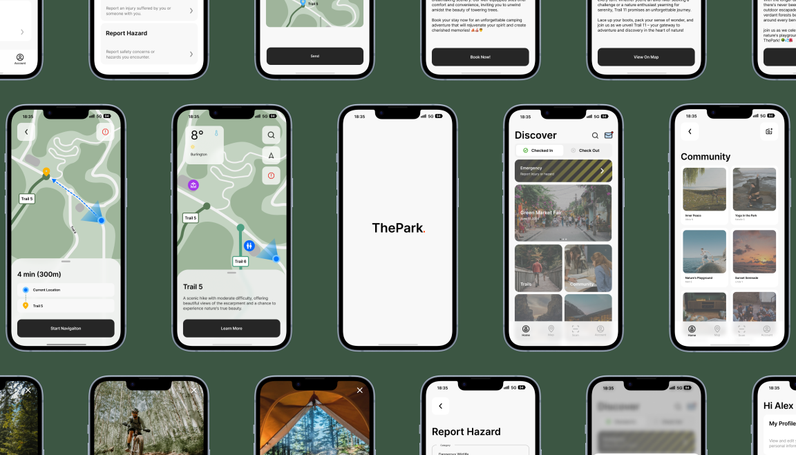
Lets explore the four main features on the apps’s nav bar
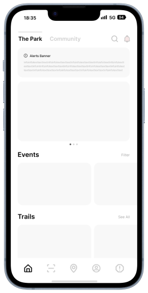
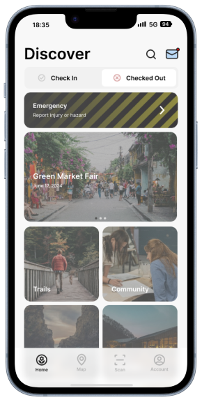
Homepage
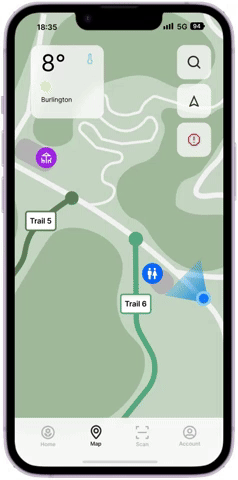
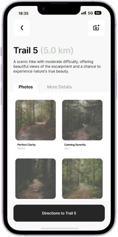
Map
Scan Feature
My Account
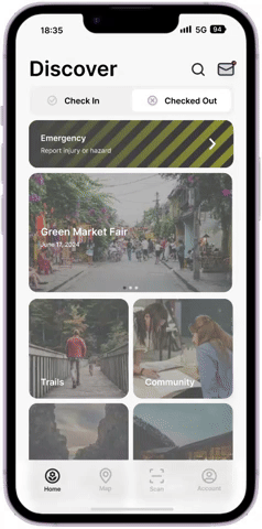
The homepage
From the homepage, users can:
View notifications
Check in or out of ThePark.
Report an emergency
See upcoming events
Access key park info
Homepage: check-in & out process
Homepage evolution
Before
After
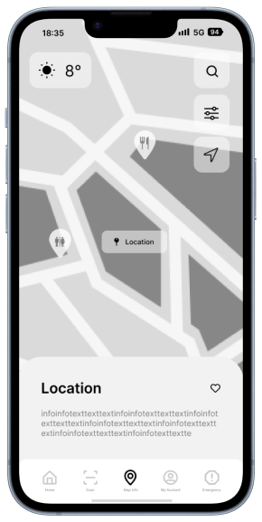
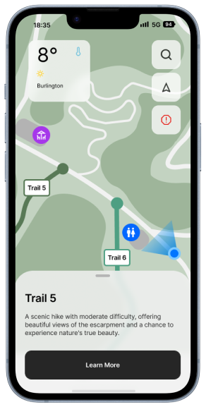
Map: Trail Info
Through the map, users can find and learn about trail and facility information.
Map: Directions
Through the map, users can also find directions to their chosen destination.
Map evolution
Before
After
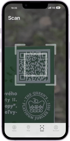
Scan
User can scan a QR code on a park sign learn more about trail vegetation, animals, and history.
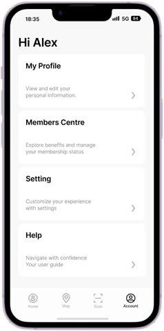
My account
Through this section, users can:
Edit profile information though, “My Profile”
Change their plan though “Members Centre”
Change their settings through “Settings”
Get technical support through “Help”
Access key park info
testimonial
This user testing quote effectively illustrates the value of this app.
“I remember going through Algonquin Park and there was a bunch of us and it was... it started to get dark. I think that this app would've helped us. We all had cell phones at the time, but it was like follow the red dot or placements on the trees. And I mean eventually we all made it safely back to our cars. However, I feel like [having] something like this app- I would've felt a bit safer because I was like... I don't think everyone knows where we are at. So I think that's great. I love the feature, especially that has the emergency hazard/function. So way to go with the creation of this app.”