
PROJECT
Indigo In-store Navigation
A map feature added to the Indigo web-app
My role: UX & UI Designer
Platform: Mobile App
Tools Used: Figma
context
I went to an Indigo bookstore to find a problem to solve.
Problem identified
Those facing mobility issues enjoy browsing around the store, but often face barriers relating to moving around.
Case Study SUmmary
The following case study documents how I identified this problem, and how I determined a design solution.
Process
Step #1
Observe
Step #2
Analyze
Step #3
Design
Step #4
Refine
Part #1: Observe
Lets see some of the observation details!
Where I observed
Indigo book store at Erin Mills Town Centre
What did I observe
I observed the customer experience browsing for books, from the moment a customer entered, to the moment they stood in line to make a purchase.
How long did I observe?
I observed customers at Indigo for two days, over the course of 4-5 hours per session. This is a total of 8-10 hours.
I recorded my observations in a table, keeping note of body language and how customers interacted with their surroundings
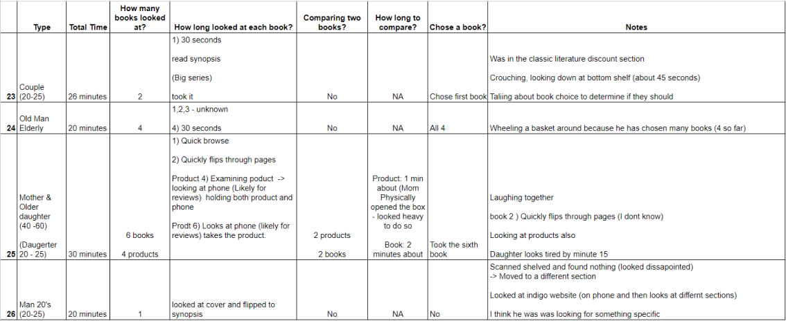
Quantitative observations included:
Average time spent in store:
20.6 min
20.6 min
Average time spent looking at a single book:
1min & 20s
1min & 20s
Average time comparing 2 books:
1.7 min:
1.7 min:
Range of books looked at:
1-19 books
1-19 books
Average # of books & products looked at:
4.2 books
4.2 books
Percentage of people that chose a book to buy:
56%
Largest age range:
20-25 (38%)
20-25 (38%)
Smallest age range:
Elderly (16%)
Elderly (16%)
Qualitative observations included:
- All parents of young children or infants were distracted by their kids when browsing.
- People check their phones while browsing. While I could not confirm what all phone users were looking at, I could see some of them using the Indigo website.
- Many people quickly flipped through the pages in an attempt to understand the book.
Disability related quantitative observations included:
Difficulty walking
Holding heavy books
Looking tired/lack of energy
Expressions such as long sighs
Crouches to bottom shelf
Twists strangely to see books on lower shelves
Hunched over when looking at books
Part #2: Analysis
Hypothesis from observations:
For people with mobility challenges, the more time they spend in store leads them to feel more physical discomfort.
Lets see if the data backs this hypothesis!
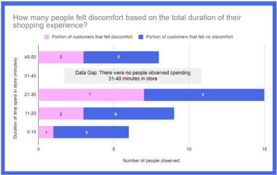
The longer a customer spends in store, the more likely they are to experience discomfort.
The only exception is that the percentage of discomfort decreases for those who spent 45-50 minutes in the store, at 38%
This confirms my hypothesis: Discomfort significantly increases after spending more than 20 minutes in the store
Let’s find out what kind of discomfort is being experienced.
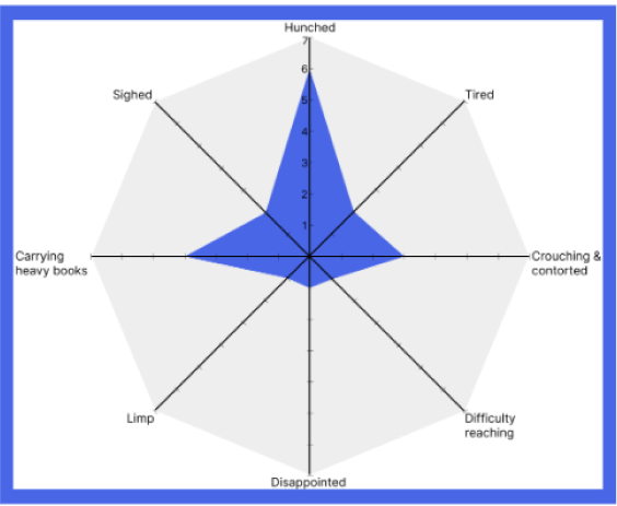
Most people had trouble with general discomfort while browsing for books
This included being hunched over while reading, contorting their bodies while looking at low shelves, and carrying heavy books.
I used an ERAF diagram to better understand the various factors that contribute to the shopping experience.
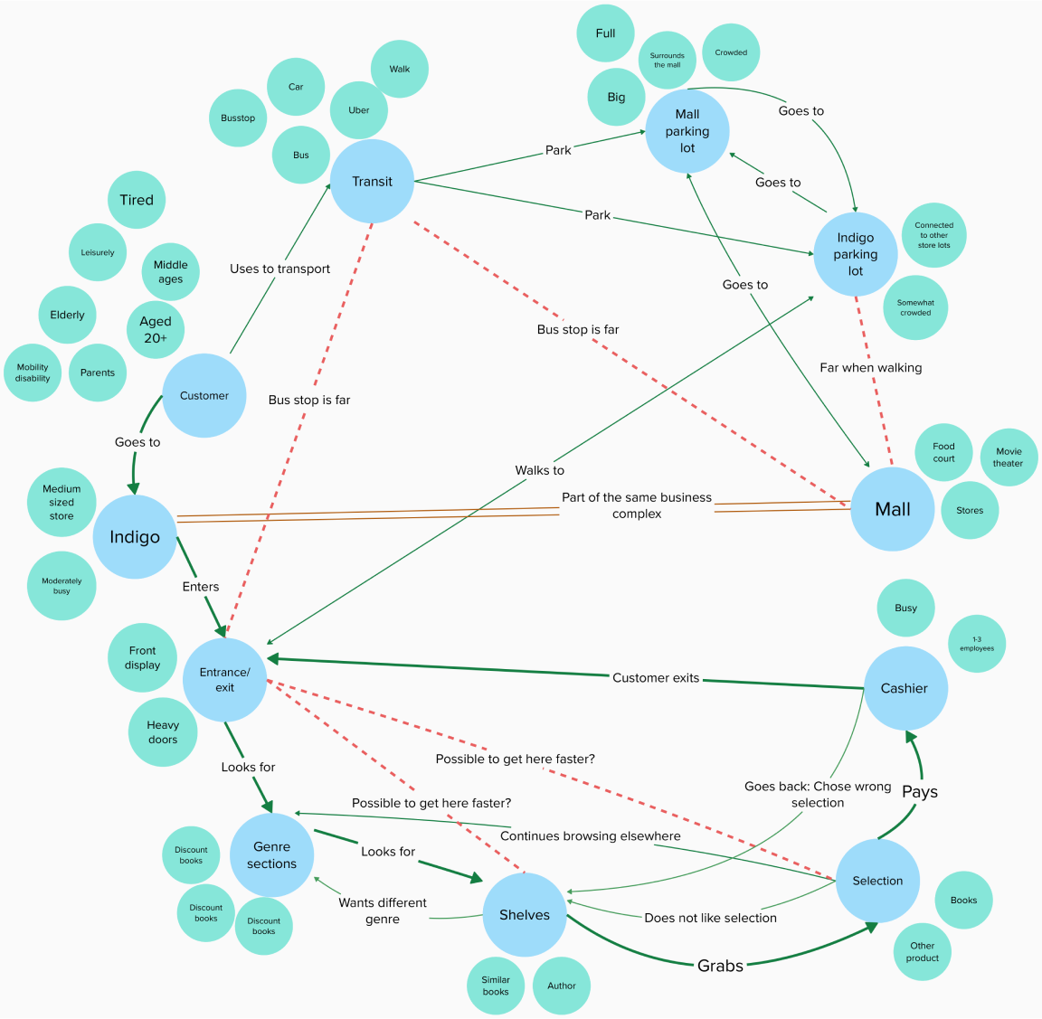
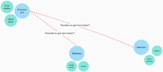
An unrealized relationship includes allowing a customer to find a book directly from the entrance.
Addressing this unrealized relationship can solve the previously stated inefficiency when looking for a book.
Part #3: Design
As a design solution, I added an in-store navigation feature to the Indigo website to help browse and find books more efficiently.
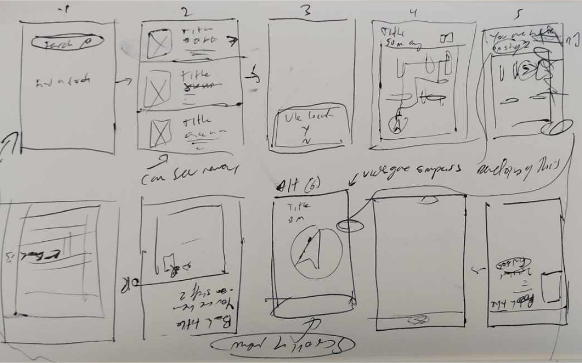
I used these sketches to brainstorm user flows and features
I researched existing map interfaces to inform my prototypes
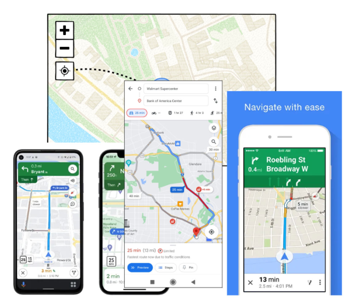
Takeaways from these visual references were
Include a locator button
Add directions at the top of the display for AR view
Include how many metres away the destination is
Include small buttons at the bottom to switch navigation options.
Include a slide up menu for list directions.
I then created medium fidelity prototypes for this scenario
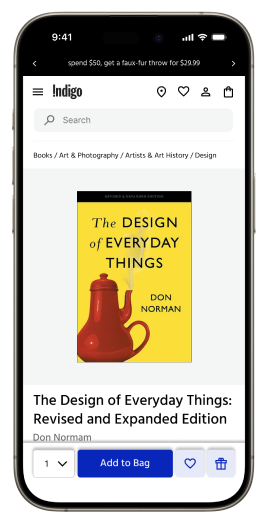
Start on Indigo website.
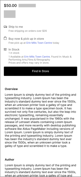
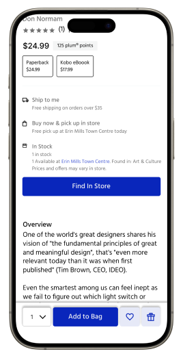
Scroll down. Click “Find In Store”.
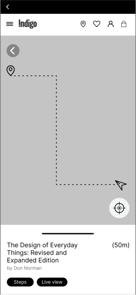
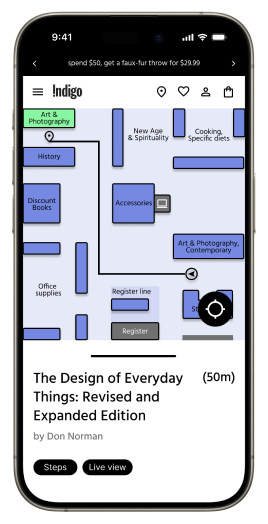
User enters map with directions to book.
User follows live map.
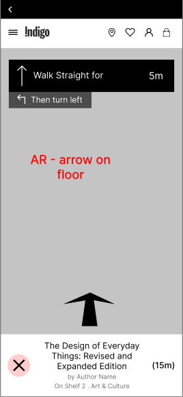
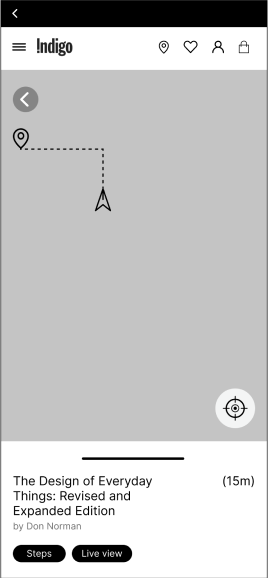
Uses AR live view as she gets closer to book.
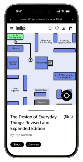
User gets closer to book.
User uses compass to locate nearby book.
Book is highlighted on the screen.
Part #4: Refine
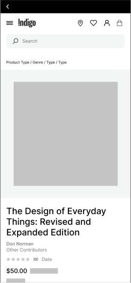
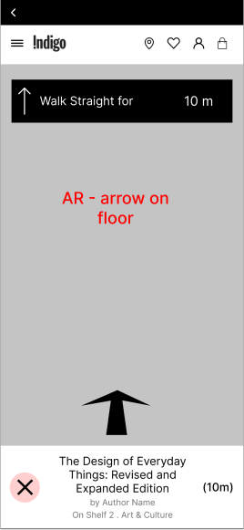
I then created the high fidelity design.
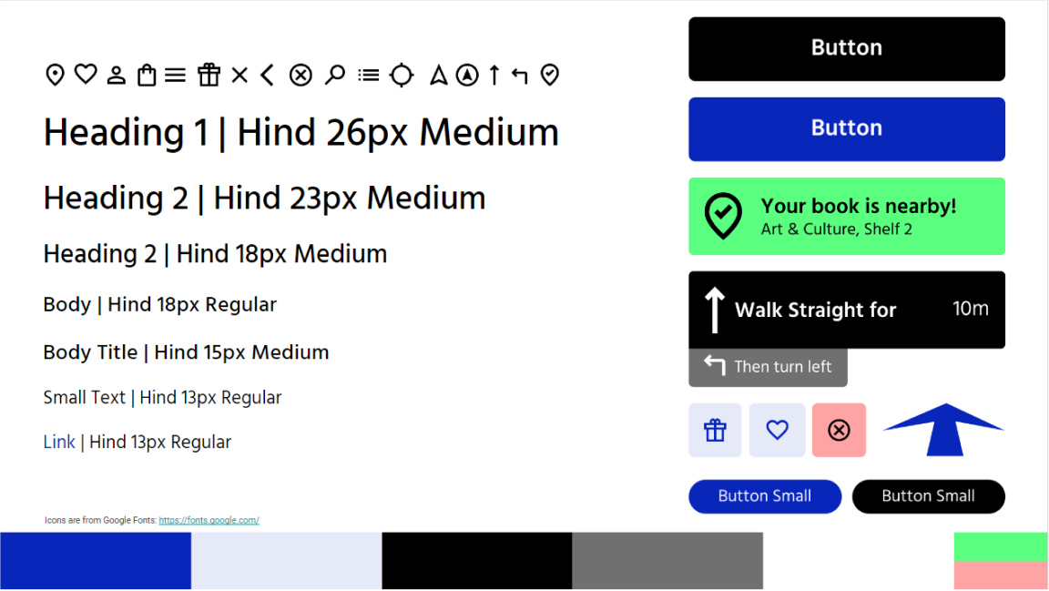
To refine the design, I created a style tile to fit the Indigo branding.
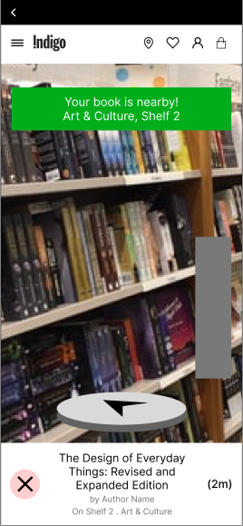
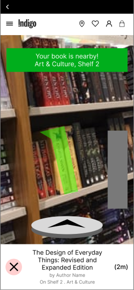
High-fidelity prototypes
Start on Indigo website.
Scroll down. Click “Find In Store”.
User enters map with directions to book.
User follows live map.
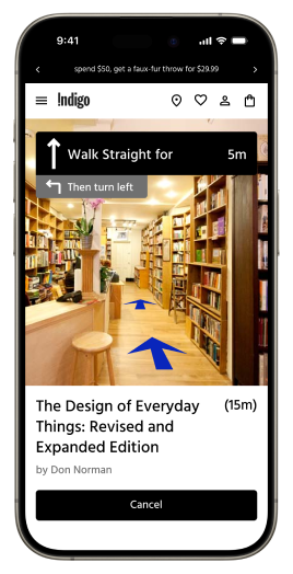
Uses AR live view as she gets closer to book.
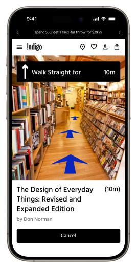
User gets closer to book.
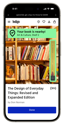
User uses compass to locate nearby book.
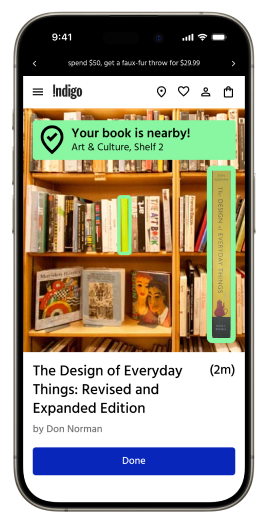
Book is highlighted on the screen.